A capable product still needs a clear introduction.
A healthcare buyer arrives with a practical problem. Historical records may be spread across old systems. A clinical team may need help using its electronic health record. The first job of a product website is to connect that problem to something the visitor can understand and evaluate.
At 314e, Muspell and Jeeves serve different needs. Muspell deals with healthcare data; Jeeves supports EHR learning. In 2020, the website presented them as Muspell CDR and Speki EHR Help. Speki later became Jeeves. The names changed, and the products continued developing, but the website challenge remained familiar: translate specialist capabilities into a useful first impression.
This case study follows that shift through the actual websites. The before screens come from November 2020, before the 2021–2022 period. The after screens show the current public product pages. That makes the comparison about an evolving web experience, rather than a new concept layered over the brand.
The information was there.
The visitor had to work through it.
The original Muspell page introduced a clinical data repository through its underlying standard and server capabilities. It moved into deployment, performance and technical features before explaining archival scenarios further down. For a technical evaluator, that detail was useful. A visitor still identifying the right solution had more interpretation to do.
Speki opened by explaining the tension between reducing classroom training and giving clinicians immediate help. Its later sections described contextual support, learning resources, benefits and implementation. The central idea was relevant, but the opening asked the reader to process the problem before seeing how the product would fit into their day.
Both pages had substantial material to work with. The opportunity was to change the order in which that material became useful: establish relevance quickly, give the visitor something concrete to inspect, and make continuing the conversation straightforward.
Archive note: the original 2020 pages survive, but some styles and images do not load in Wayback. The before screenshots show that partial replay as it is. Missing graphics and broken styling are not treated as defects in the original design.
Two products.
Two real website comparisons.
Switch between Muspell and Jeeves to inspect the original product page alongside today’s version. Each screenshot opens at a readable size; the full-page captures preserve the rest of the experience.
Muspell: from the infrastructure to its value.
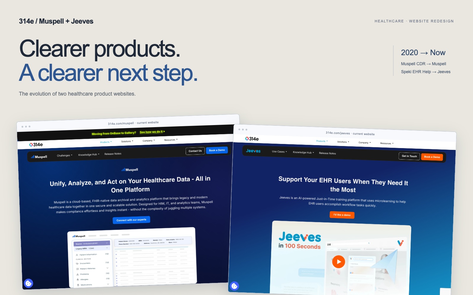
The current opening brings the broader data proposition forward. Product identity, a summary, an expert-contact action and a viewer visual occupy one introduction. A dedicated product navigation offers routes into buyer challenges and supporting resources, with a demo action that remains easy to find.
The distinction is one of emphasis. The older page establishes the technology before developing its applications. Today’s page gives the visitor an overview first, then lets them explore deeper. That is a more useful sequence for someone deciding whether to bring a specialist colleague into the evaluation.
Jeeves: make the learning experience visible.
The current Jeeves page puts the user’s moment of need at the centre of its introduction. A brief description, a conspicuous demo button and a product-video preview sit together. Later sections show the experience inside the EHR and separate learner-facing capabilities from tools for training teams.
The earlier Speki page already contained the idea of contextual assistance. The newer presentation makes that idea easier to inspect. It gives a buyer a visual entry point before asking them to absorb the full feature set. The rename matters too: older references to Speki belong to this same product history.
Give the visitor something to evaluate.
A product visual has a different job from a decorative illustration. It helps a visitor ask specific questions: what will my team see, where does this fit, and which part of the task does it support? That turns a broad claim into the beginning of an evaluation.
The design lesson is to put the visual next to the question it answers. A viewer helps explain access to information. An in-workflow demonstration helps explain where assistance appears. Both give the accompanying copy a concrete subject, instead of making the reader assemble the experience from separate paragraphs.
Supporting content also needs a deliberate sequence. A first-time visitor may need the overview; a technical evaluator may move straight to integrations or controls. Clear headings and product navigation let those readers take different routes without requiring separate websites for every audience.
Make the next step visible
when the visitor is ready.
In this context, conversion means progressing to a relevant conversation. The interface should make that step easy to recognise, while still giving buyers enough information to decide whether a demo is worth their time.
The current pages place a demo action in the product navigation and another action in the opening section. The colour treatment distinguishes the two products while preserving a familiar interaction pattern. A returning visitor can act immediately; someone new can continue reading without losing the route back.
Repeating an action is useful when the surrounding content adds a reason to take it. The visitor may be ready after the opening, after a demonstration, or after checking a relevant capability. The page should support those different decision points instead of reserving all contact options for the footer.
Clarity also depends on consistency. Navigation, headings, spacing and action styles should help the buyer recognise what is important at a glance. Each section needs one clear purpose. When everything competes equally, even a prominent button can become another element to ignore.
Better communication creates
a better starting point.
The visible change is a more direct route from introduction to product evidence and enquiry. The websites give buyers more ways to understand what they are looking at and where to go next. That is the conversion rationale behind the UI upgrade.
The products also evolved between 2020 and today, so this is not a controlled A/B comparison. No verified conversion dataset is available for this case study. A numerical uplift would need consistent traffic measurement, successful enquiry submissions and qualification data; the screenshots alone cannot establish it.
Help the buyer understand enough to want the next conversation.
For complex healthcare products, that is a useful design standard. Explain the value early. Show the experience. Keep the technical depth available. Make the next step unmistakable. The website becomes more effective when those decisions work together.
Original pages & capture dates
- Muspell CDR · Wayback, 28 November 2020, 18:55:13 UTC. Original product page; partial archive rendering.
- Speki EHR Help · Wayback, 28 November 2020, 18:51:23 UTC. Original product page; partial archive rendering.
- Muspell · Current public website and Jeeves · Current public website. Browser screenshots captured on 9 October 2026. Cookie notices dismissed through their controls; product content unchanged.
- 314e announcement · 24 March 2022. Confirms Jeeves was previously called Speki.