The primary task had competition.
Redemption, gateway branding, legal text, chat and CAPTCHA all claimed space. On mobile, that made the route to payment harder to read.
A business case for better checkout
A clearer last step for IRTH, House of Titan. Redesigning payment around familiar choices, visible savings, and the confidence to complete an order.
Inside the redesign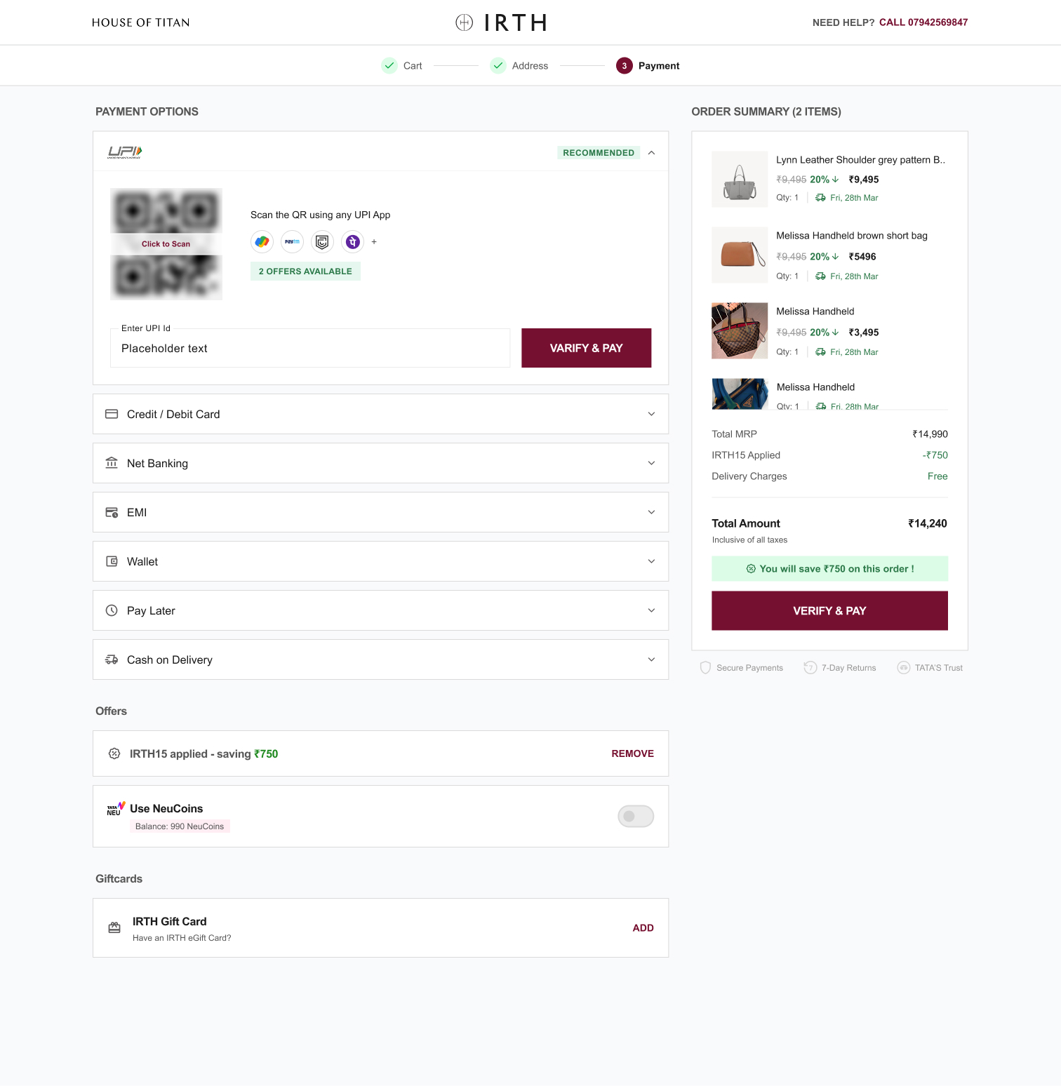
01 / The commercial problem
A customer has found her bag, accepted the price, and entered her address. Payment should help her finish. Instead, the experience asked her to decode another interface.
The brief was to redesign IRTH’s payment page: reduce abandonment, encourage prepaid payment, and bring the experience back into the brand’s modern, minimal language. The business opportunity was to get more value from customers already entering checkout.
We connected that brief to the whole decision journey: what appears first, how benefits are revealed, where the gateway takes over, and how the customer knows the order is complete.
Checkout abandonment
Checkout-to-purchase conversion
Average payment time
Improve conversion
Baseline and ambition: project BRD, pp. 2–4. The 60% loss covers checkout → purchase; it does not establish that the payment page caused every abandonment. The brief does not specify whether “10%” means relative growth or percentage points.
02 / From gateway-led to customer-led
The old page led with redemption panels and a Razorpay-branded payment card. The redesign gives payment methods a clear hierarchy, makes secondary benefits easier to scan, and restores IRTH’s visual ownership.
Loyalty and gift cards appear before payment. The primary action competes with gateway branding and legal copy.
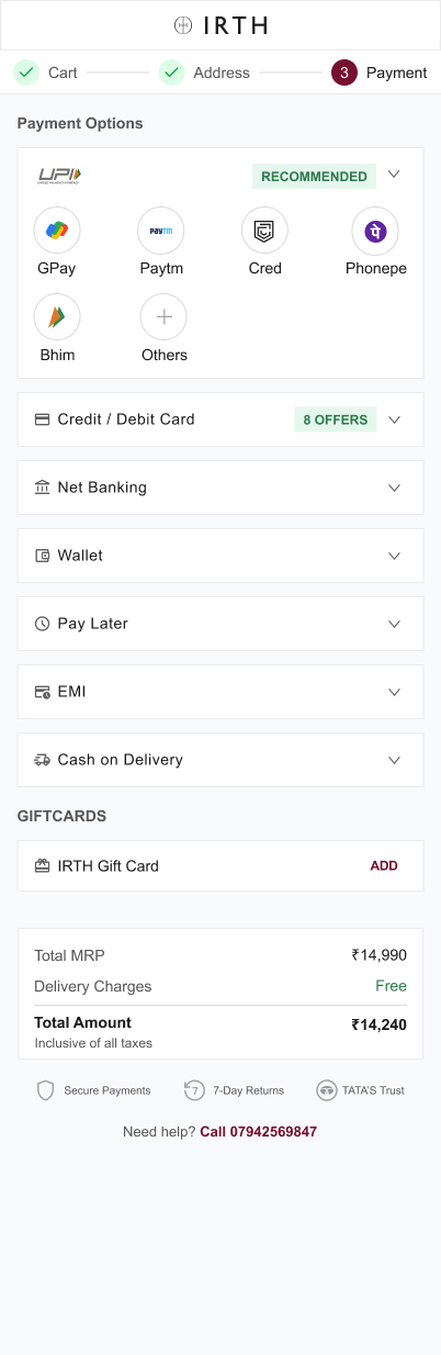
UPI apps become recognisable entry points. Other methods stay available without demanding equal attention.
The composition leaves the customer to interpret the gateway’s payment proposition.
Payment and order context sit side by side. Savings, the payable amount, and reassurance support commitment.
Original project exports. Select any screen to inspect the design at full size.
Redemption, gateway branding, legal text, chat and CAPTCHA all claimed space. On mobile, that made the route to payment harder to read.
The presentation’s audit found cart details and coupons repeated at the address step. Customers were being asked to review information before they could act.
The final decision needed an obvious total, visible savings, and clear order expectations. These became part of the payment hierarchy.
03 / Understand the customer. Protect the business.
She discovers a bag on her phone during a busy day, then returns to buy when she has a quiet moment. The design needs to support resuming a decision, with minimal re-reading and recognisable ways to pay.
The benchmark was useful for patterns. IRTH’s business context decided which ones belonged.
The project reviewed Miraggio, Hidesign and Nicobar: compact checkout, accessible order summaries, visible savings, and approaches to guest identity. The transferable lesson was to preserve momentum.
But Titan’s ecosystem gave sign-in another purpose: access to customer relationships and benefits such as NeuCoins. Our direction was to communicate that value clearly, without turning authentication into an unexplained interruption.
| Observed pattern | Decision for IRTH | Business reasoning |
|---|---|---|
| Compact checkout and collapsible summaries | Reduce repetition; keep the order accessible. | Maintain momentum without removing information needed to commit. |
| Visible prepaid savings | Give online payment a clear place in the hierarchy. | Support prepaid preference while keeping eligible COD available. |
| Guest-first checkout | Retain a meaningful sign-in proposition. | Protect the value of Titan’s connected customer ecosystem. |
Benchmark observations and working persona: original project presentation.
04 / Restructure the journey
Review the bag.
Resolve quantity and price.
Choose where it goes.
Avoid repeating the cart.
Choose a method.
Understand the final amount.
Know the order is placed.
Know what happens next.
The payment page became a sequence of decisions: how to pay → which benefits apply → what leaves my account. Mobile uses progressive disclosure; desktop uses the space beside the task for order context.
Cart and address changes were journey recommendations. The supplied detailed exports concentrate on payment and confirmation.
The delivery decision
Lead with “Pay Online” and its savings, make COD secondary, group offers and redemption, and clarify the payment CTA. Razorpay continues to handle method selection.
Surface UPI apps and payment-specific states within the brand experience. Use mobile app handoff and desktop QR patterns appropriate to each device.
Both routes are present in the design presentation. The screens in this case study explore Route B. App selection starts a payment flow; authorisation and verified payment confirmation still have to follow.
05 / The work inside the work
The design effort extended beyond the default screen: saved cards, alternative methods, offer eligibility, instalment selection, and the moment after payment. Each state needed to keep the customer oriented.
UPI apps appear as recognisable choices on mobile. Desktop offers a QR pattern with UPI ID as an alternative. Other methods remain available below the primary choice.
Reduce the effort of finding a preferred prepaid method, while preserving customer choice.
The expanded state also explores manual UPI ID entry and an inactive payment action before valid input. The visual recommendation is a design choice, not a claim about measured method share.
A single export of expanded payment states. Inspect the full sheet to see the interaction coverage.
Inspect all states ↗Plan selection stays beside the order context. The layout adapts while the decision remains familiar.
Inspect desktop design ↗06 / Clarity is a brand behaviour
IRTH’s burgundy gives action a consistent visual identity. Quiet surfaces and outlined groups separate methods without turning the page into a wall of competing panels.
Offer details move into a focused sheet. A customer can check the conditions and return to the same purchase context. The confirmation screen then closes the loop with an order reference, amount paid, payment method, and delivery expectation.
07 / Design ambition meets delivery reality
A clearer interface earns its value only when the amount, eligibility, and payment status remain trustworthy.
The exported designs establish the interaction direction. The proposed delivery checks connect that direction to implementation: reconcile transaction values, make eligibility explicit, and define the full payment lifecycle.
Coupons, NeuCoins, gift cards and method-specific offers must resolve to the same total across the page, gateway and confirmation.
The BRD disables COD below ₹1,000. Explain that rule in context. Offer and instalment conditions must be available before commitment.
Define pending, failed, cancelled and expired payment states, safe retry, and confirmation based on verified payment status.
These are original design exports. Some contain placeholder labels, inconsistent product counts, and offer or price examples that do not reconcile. They are shown as design evidence. Their example transaction values are not used as business results or as inputs to the revenue model below.
08 / The business case
The design outcome is a clearer payment hierarchy, a mapped set of payment states, and two implementation paths. The revenue opportunity can be modelled; realised uplift still needs measurement.
Illustrative scenario
The baseline is from the BRD. The proposed conversion and order value below are assumptions, not IRTH’s post-launch results.
Explore the opportunity
Fixed cohort: 10,000 checkout entrants. Traffic and order value are held constant to isolate the conversion assumption.
per 10,000 checkout entrants
10,000 × (46% − 40%) × ₹4,500 = ₹27,00,000
This models gross order value, not profit or recognised revenue. It excludes cancellations, returns, taxes, payment fees and incremental incentive costs. On a relative interpretation, the brief’s +10% goal would mean 40% → 44%, or 400 additional orders per 10,000 checkout entrants.
How we would establish impact
Compare the current and redesigned experiences in a controlled experiment. Keep the conversion denominator consistent, and segment mobile versus desktop, new versus returning customers, and payment method.
Proposed measurement plan. No experiment sample, duration, significance result or post-launch analytics was supplied.
09 / The takeaway
For IRTH, the opportunity was to make an existing purchase decision easier to complete.
This project connected interface craft to a business problem: preserve intent, make prepaid payment easy to choose, keep Titan’s ecosystem benefits accessible, and end with certainty.
The deeper lesson is about prioritisation. Simplification means deciding what deserves attention now, what can wait for a tap, and which dependencies must be resolved before a design can deliver its commercial promise.