Burn the annotation into the frame
The box, the callout, the blur and the arrow are composited into the exported video. What the learner receives is one flat file.
A video editor built for clinical educators — and the layer model that lets a single Epic screen recording publish as a video, a tip sheet, an interactive lesson and a guided tour.
Training that lives inside the EHR, at the moment the task is actually in front of you.
CASE STUDY · APPROX. 12 MIN READScreens are from the working product. Demonstration strings left in the build have been replaced with representative clinical content, and one customer's identifying marks removed. Reported outcomes are from the KLAS Spotlight Report 2025 and the client's own reporting, not from a study we ran.
01 / Understanding the work
An EHR is the most-used and least-forgiving piece of software in a hospital. Staff are trained on it once, at induction, and then meet it every shift for the rest of their career.
Jeeves sits inside that gap: a just-in-time training platform that opens within Epic, so a nurse can find the answer to a workflow question without leaving the chart. The learner-side problem is well understood. The one we were asked into was on the other side of the wall — the people who have to make the content.
A clinical informaticist supporting a hospital network is not a media team. They are one or two people with a screen recorder, and they answer to every upgrade, every policy change and every department that wants its own version. When a workflow changes, the same piece of knowledge has to be produced three or four times over: record the video, write the tip sheet, rebuild the walkthrough, set the quiz.
Those artefacts start identical and immediately begin to drift. The video gets re-recorded after an Epic upgrade; the tip sheet does not. Six months later the two disagree, and the learner has no way to tell which one is current.
02 / The decision it rests on
Every video editor ever built answers one question the same way: when you draw a box on a frame, where does the box go? It goes into the pixels. You render, and the box is now part of the picture, indistinguishable from the screen it sits on.
That answer is cheaper to build and cheaper to play. It is also the reason a training video can only ever be a training video. We took the other answer, and it is the single decision the rest of this case study depends on.
The box, the callout, the blur and the arrow are composited into the exported video. What the learner receives is one flat file.
Each mark is a record — a type, a position, a payload, a start and an end — held above the video rather than inside it, and drawn at play time.
Drag the playhead — one layer graph, three readings
00:00 / 03:35Drawn over the frame at play time. The learner can switch it off.
Step 1
Locate the MAR activity on the patient's toolbar. If it is not visible, open More Activities and select MAR.
The same object, printed: its frame becomes the screenshot, its payload becomes the caption.
The same object, walked: position becomes the spotlight, payload becomes the tooltip.
Three panes, one data structure. Nothing here is re-authored — the box, the blur, the callout and the hotspot are the same four records, read three different ways. A reconstruction of the model, built for this page.
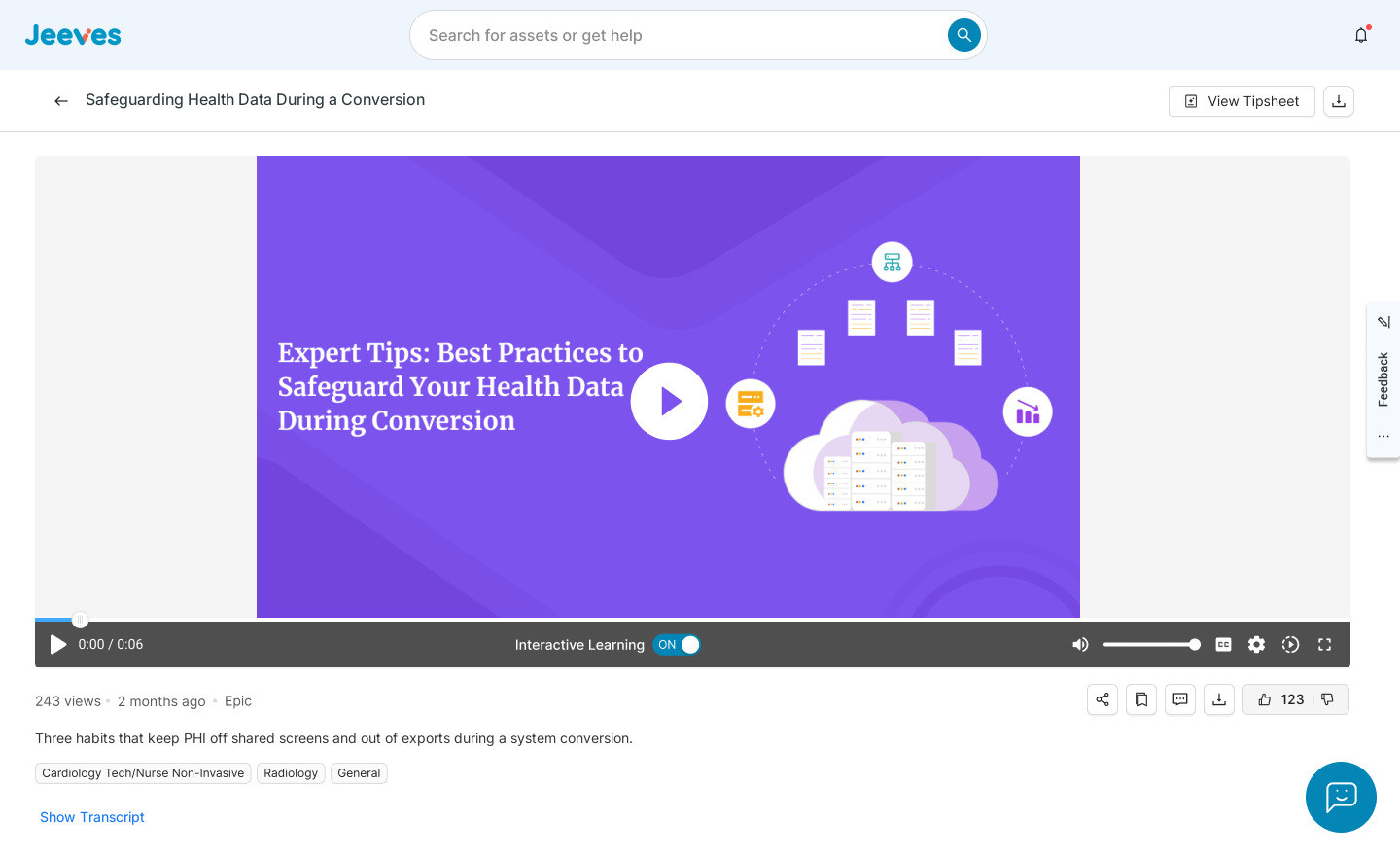
There is a small switch in the learner's control bar labelled Interactive Learning. Turn it off and the boxes, callouts and questions disappear; the underlying screen recording keeps playing. Turn it on and they come back.
That switch is only possible because the annotations were never part of the picture. It is a modest control, and it is the most honest evidence that the architecture underneath is what this case study says it is.
The recording with its layers drawn over it, scrubbable and captioned.
For watching it doneThe same video, but it stops and asks — knowledge checks, hotspots, typed responses.
For proving you got itNumbered steps, annotated screenshots, printable and pinnable at the workstation.
For scanning at speedThe steps replayed as a spotlight and a tooltip, one stop at a time.
For doing it alongside03 / The authoring tool
The person using this is a clinical informaticist with forty minutes between meetings. They know Epic completely and Premiere not at all — and the thing they are making has to be correct, because a nurse will follow it.
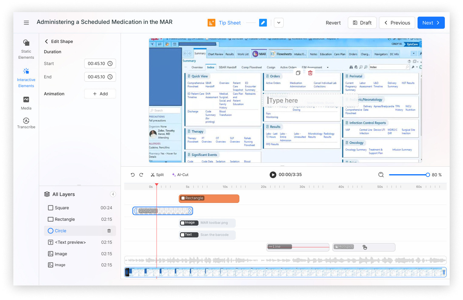
So the editor could not be organised the way editors are organised. Tracks, keyframes and compositing modes are the vocabulary of the craft, not of the job. We grouped the tools by what they do to the learner instead: things that mark the screen, things that stop and ask, things that add media, and things that handle the words.
One property is shared by every object in all four groups: duration. Start and end. That single row in the properties panel is what makes an annotation addressable later — it is how the tip sheet generator knows which frame a callout belongs to, and how the tour knows what order the stops go in.
The tool rail, grouped by effect
FOUR GROUPS / ONE SHARED PROPERTYMarks the screen. Never interrupts.
Stops the video. Requires an answer before it resumes.
Brings a still into the timeline as a layer of its own.
Supplies the prose that the tip sheet and the tour reuse.
A screen recording of a live EHR test environment will contain names, MRNs and dates of birth. In a normal editor, blur is a stylistic choice. Here it is the difference between a publishable asset and a disclosure.
Keeping blur as a layer rather than a burned-in effect had a specific consequence we designed for: it can be re-verified. Every re-render walks the blur layers again, and the processing screen says so in as many words. An educator who trims the video later does not silently lose a redaction.
The image editor carries the same tools for stills, plus an AI Steps Creator that reads the text on a screenshot and places numbered step markers on it — a job that otherwise takes an hour of careful clicking per tip sheet.
04 / Teaching inside the frame
A video that plays to the end tells you nothing about whether it landed. Three tools in the Interactive group exist to interrupt that: a knowledge check that stops and asks, a hotspot that requires the learner to find the control themselves, and an input response that makes them type the value back.
Because these are layers with a start time, they can be placed exactly where the difficulty is — not bolted on at the end as a quiz. The question about the administration time appears at the moment the administration time is on screen, and it overlays the paused frame rather than replacing it, so the screen being asked about stays visible behind the answer.
Authoring questions is the slowest part of the job, so the transcript is put to work: the platform proposes questions drawn from what was actually said and shown, and the educator selects, edits or discards. Nothing is inserted without someone choosing it.
05 / The second reading
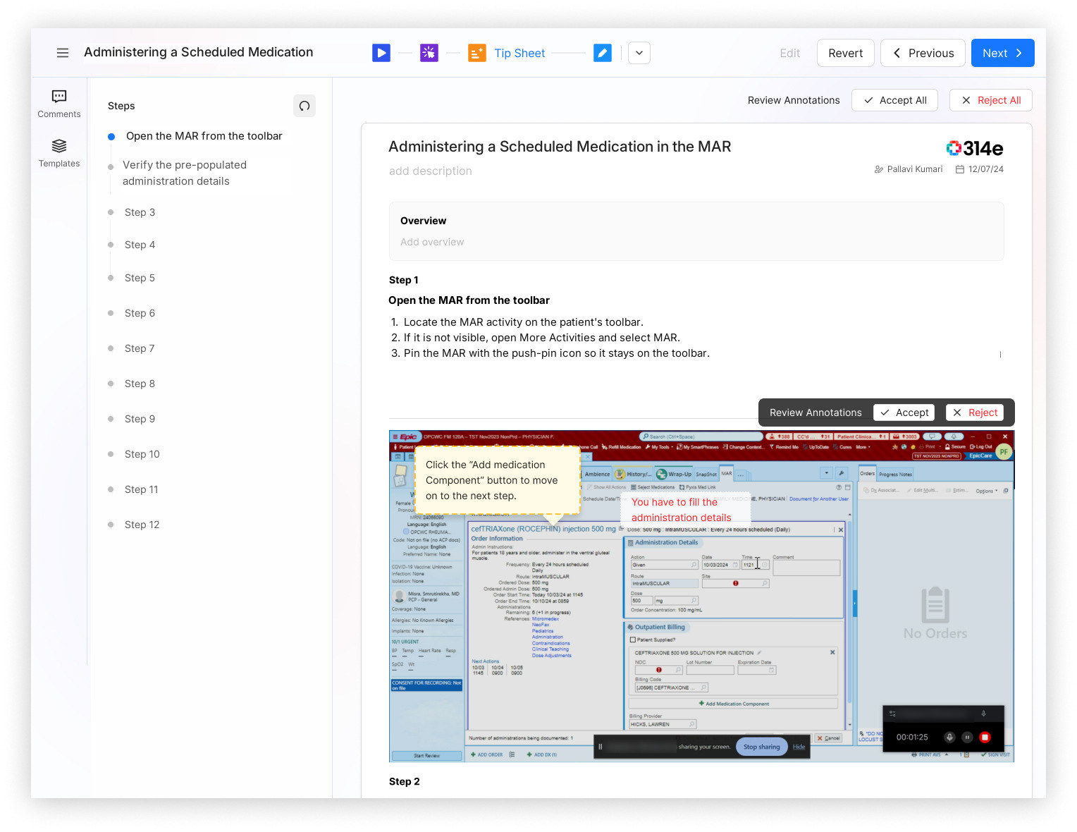
When an educator switches the format selector at the top of the editor from video to tip sheet, nothing is converted. The generator walks the same layer graph and answers three questions per step: which frame, which marks, and which words.
The frame comes from the step boundary. The marks come from the annotations alive at that timestamp — the box, the callout, the blur — redrawn onto the still. The words come from the transcript segment that spans it. A twelve-step tip sheet with twelve annotated screenshots is the same twelve records the video already had.
Generated content is visibly generated until a person accepts it. An educator should never have to guess which sentence they wrote and which one arrived.
Reject is the same size as Accept, sits next to it, and needs no confirmation. If saying no is expensive, approval stops meaning anything.
Progress is reported per step, and an interrupted job says it can be resumed. Silence during a long automated task is read as breakage, and breakage is read as untrustworthy.
06 / The third reading
A video shows you. A tip sheet tells you. A guided tour walks you through, one stop at a time, with everything but the thing in question dimmed.
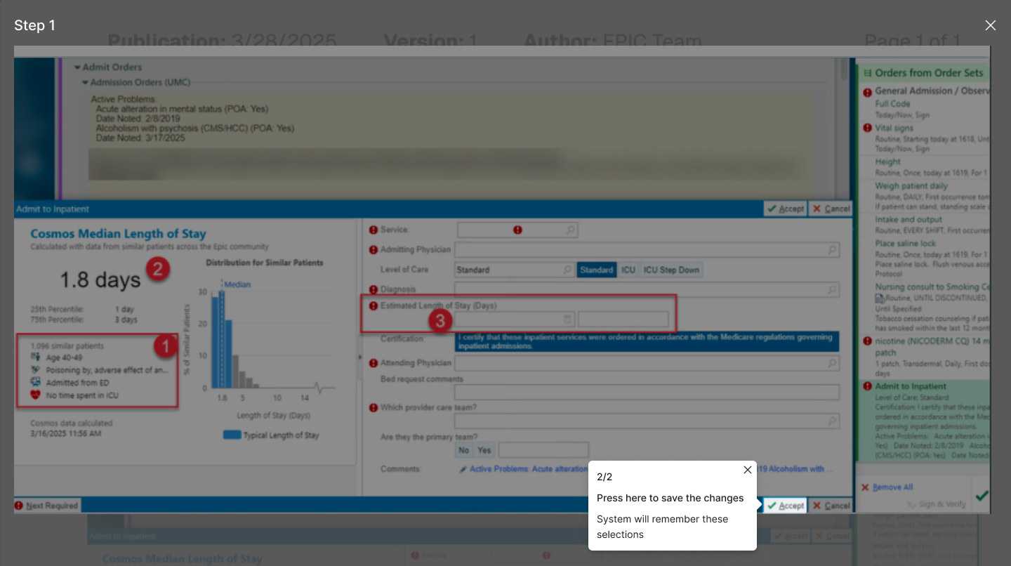
The tour is built from the tip sheet, which was built from the video — three formats deep, and still no re-authoring. Each step contributes its frame and its position; the tour draws a spotlight at that position and hangs the step's text beside it.
Two things needed designing that the other formats did not need. The first is orientation: a stop count and a step rail, because unlike a video there is no scrub bar telling you how much is left. The second is escape — every stop can be left, and the learner returns to the document they came from rather than to nothing.
07 / On the floor
All of the authoring work above is only worth its cost if it changes what a nurse experiences at a workstation, mid-shift, with a patient waiting.
What it changes is choice. The same asset can be watched, scanned, practised or walked — and the learner picks by situation rather than by whatever the educator had time to make. Two minutes before a med pass, the tip sheet. Learning the workflow for the first time, the tour. Being assessed on it, the interactive lesson.
It also changes what search can return. Because the transcript, the step titles and the annotation text all belong to one asset, a question typed in the words a nurse would actually use resolves to a specific step of a specific workflow — not to a forty-minute course that mentions it once.
Results carry the format on the card, so the learner chooses how to receive the answer at the same moment they find it.
The document scrolls with the video, so a learner can read ahead or drop back without losing their place in either.
Instruction widget launches the guided tour from the page the learner is already reading — the document and the walkthrough are the same object.
Assignments in progress, what to learn next, what colleagues are learning — the same library, sorted by obligation rather than by curiosity.
08 / Outcome & reflection
Recording a workflow was never the expensive part. The expensive part was producing the same knowledge three more times, and then keeping four drifting copies of it honest through every upgrade.
Treating an annotation as an object rather than a pixel is what collapsed that. It is an unglamorous decision — no one sees it, and its most visible artefact is a small toggle in a control bar — but every feature in this case study is downstream of it.
In the KLAS Spotlight Report 2025, the platform scored A+ on ease of use and A on value and outcomes, with organisations reporting measurable value within the first quarter of deployment. These are the client's and KLAS's figures, from operational reporting rather than a study of these features in isolation.
The tip sheet, the tour and the interactive lesson did not need three feature designs. They needed one shared object with a start and an end. Getting that right early made three later features cheap, and would have made them impossible if we had got it wrong.
Generated annotations, questions and narration all pass through a review gate, and that gate cost real screen space and real clicks. It is worth it. In a clinical setting a single wrong automated output does not lose you a feature — it loses you permission to automate anything.
One source means a correction propagates. It does not yet mean the system notices that Epic changed underneath a recording made eight months ago. Detecting drift between a captured workflow and the live one is the problem worth solving next.