A number needs its unit.
12 GA, 7.62 × 51 mm and 120 mm describe different conventions. Preserve the complete designation.
A box changes hands more often than it changes shape. Someone packs it. Someone receives it. Someone has to find the right information on a crowded shelf.
For ORDEN, the design starts with that chain of readers. The product designation leads. The quantity has its own space. A picture gives context. The reference stays with the object.
The identity connects those decisions across four very different forms: a shotshell, a rifle cartridge, a hand grenade and a large-calibre tank round.
A cartridge is not just a scaled-down tank round. External form, physical size and the way information fits around it all change.
12 GA, 7.62 × 51 mm and 120 mm describe different conventions. Preserve the complete designation.
The M67 has a smooth spherical body. A generic segmented grenade icon describes the wrong form.
TP-T identifies target-practice ammunition. Its label must not quietly become an “inert” label.
A sporting carton gives the designation the largest voice. The shotgun drawing introduces the product family; the written gauge and length carry the detail.
Repeat the gauge on the side face. Keep the count visible when the front is partly covered.
The 70 mm designation is not the closed, crimped shell’s measured height.
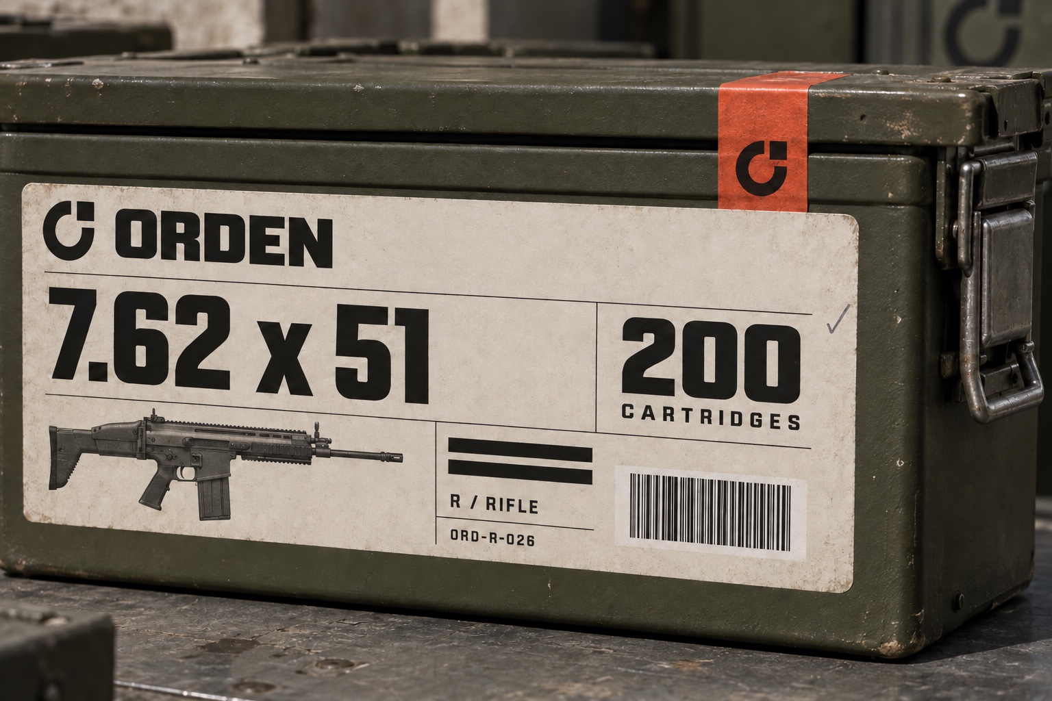
The rifle pack is a low, divided carton. The full designation remains one unit of information, with the number of cartridges separated from the model and lot fields.
Give the end flap a second reading face. A rifle profile supports recognition without replacing the written designation.
Platform drawings are visual references; the manufacturer’s markings and documentation determine compatibility.
A large label in a browser can disguise a tiny box. The hand is a useful reference: the count, designation and opening face still need to be distinct at this scale.
A grenade cannot be represented by a generic bullet graphic. The spherical M67 outline, model name and unit count form a separate reading group.
Keep the product’s own markings distinct from the packaging brand. Use a literal silhouette and retain the full model name.
The 63.5 mm reference describes the body diameter, not the total height including external fittings.
The large-calibre study starts with the entire round. Its long container needs identification on a broad side surface and a short end face. The information hierarchy stays consistent as the object changes.
Repeat the model and calibre at the end. Preserve the round’s identification markings; the orange brand accent belongs on the container.
Reference dimensions and mass: US Army portfolio, M831A1 TP-T, p.166. These describe the round, excluding its packaging.
Two published dimensions, drawn on the same scale. Complete cartridge length and grenade body diameter describe different measurements; neither specifies a package.
Source dimensions / US Army public product references. View references ↗
Three layout studies make the trade-off visible. Start with the code, then correct the hierarchy, then resolve the details around the physical panel.
The family is obvious, but the useful designation becomes a footnote.
The gauge and length move forward. The illustration adds immediate context.
Quantity, lot and barcode get their own zones. The same logic works on the end face.
Leave the barcode on a flat face. Repeat the short designation on the end. Keep the reading sequence clear when one panel disappears.
Nothing importantGive each material a job. Let the structure carry the object, and the reading surface carry the information.
A warm, low-glare reading surface. Fold the board sample before placing type near an edge.
A distinct information field against olive metal. Keep barcode margins within the paper boundary.
A quiet field around the label. Review ink and adhesive on a physical sample of the coated surface.
A small mark across the closure. Give opening and product information their own separate spaces.
Inspect the layers behind a packaging image. The label artwork defines the reading order; the photograph contributes material, perspective and light.
Artwork and photography are reviewed separately. Small printed text is checked in the flat artwork where it can be read precisely.
Select a product. Compare the calibre, model, quantity and profile. Then remove the colour.
Internal artwork references / Code 128
A large family letter cannot tell you how many items are inside. A barcode cannot replace the human-readable reference. Every field has a different job.
One unbroken field. The unit stays attached to the number.
The count names what is counted. A unit pack and an outer case are different records.
A written reference stays readable when the machine-readable field is unavailable.
Code 128 encodes the same internal reference. Keep its margins clear of illustration and folds.
Specify the packaging level.
Never leave the reader to infer it.
Product communication belongs beside the product. The insert separates identification, general storage precautions and the point at which the reader should stop.
Read the manufacturer’s label and documentation. An illustration or colour is a supporting cue, not a substitute for the exact product identification.
General safety communication draws on SAAMI’s sporting-ammunition guidance and the 3Rs of explosives safety. Product-specific operation belongs in the manufacturer’s approved manual.
The artwork has to survive a change of context: a receiving bench, a shelf, a handover. These scenes bring the reader back into the picture.
Keep the identifier on a broad, visible face.
Repeat the short designation on the end.
Preserve a distinct opening edge and reading face.
The symbol is the constant across the changing product information. Its square becomes a small point of emphasis. The wordmark stays compact so the designation has room to lead.
Three colours.
One clear hierarchy.A proposed brand palette,
independent of regulated markings.
Small cartons, an individual unit pack, a larger case and a long transit container. The family shares a graphic language without pretending the objects share a size.
The separate identity reference covers the symbol, typography, colour and graphic application. It supports the packaging team alongside the product insert.
Give every surface a clear entry point. Product designation first, quantity second, reference details third.
Use the same structure when the package changes shape.
Graphic standards / Symbol, typography, colour and artwork application.
Make the right
thing clear.
For the person who makes it.
For the person who reads it next.