Site IDCapacityProvinceAMS-0801,369NHRTD-022480ZHUTR-031780UT
The register holds capacity.
From fragmented municipal records to a shared register,
a review queue, and a traceable handover.
923,000 spaces. 42 municipalities.
A common record for the
people coordinating them.
Names are anonymised. Product screens, motion studies and process diagrams are recreated with sample data. Programme scale and reported outcomes refer to the original engagement.
01 / Understanding the work
A parking site could exist in an inventory spreadsheet, an EV workbook, an email thread and an officer’s notes. Each held a different part of the answer.
Even a routine review began with reconciliation. Which capacity figure was current? Had someone already contacted the operator? Was the site closed, or was its record simply out of date?
The brief was to bring that work into one shared product. Our three-person design team worked with parking officers in weekly feedback loops, covering screen design, interaction patterns and the move into daily use.
The register holds capacity.
Check the operator’s installation record before changing the inventory.
A separate workbook holds provision.The latest update is somewhere in the conversation. The next owner is not explicit.
Officers need a recognisable site ID, its current provision and a clear way to record what they checked.
Coordinators need to see overdue work and unassigned reviews without opening every site.
The next person needs the previous value, the new value and the reason they differ.
02 / Choosing a direction
The information hierarchy had to make the first useful action obvious. We compared two ways of presenting the same underlying records.
Hierarchy studies recreated to explain the design trade-off; these are not original research artefacts.
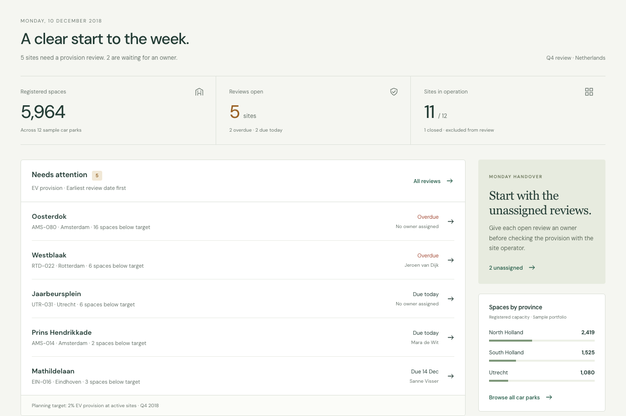
The overview answers where attention is needed. A national total establishes scale, but it cannot tell an officer what to do next.
Review dates establish priority. A named owner makes responsibility visible. Neither requires interpreting a chart first.
A province total is useful when it leads to the corresponding records. It becomes an entry point into the work.
03 / The product model
The site is the stable unit. Overview, search and review are ways of reaching it.
Officers already use car-park numbers to locate information. Search accepts the site ID as well as the name and city. Province and site status remain visible as separate filters.
Once a site is open, its capacity, EV provision, owner and history sit together. Returning to the register preserves the query, so investigating one record does not mean starting the search again.
Capacity · Provision · Ownership
A city search narrows the register. Opening Oosterdok and returning keeps that search intact.
04 / Designing the review
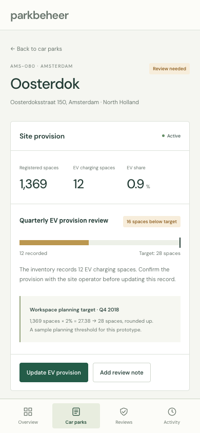
Oosterdok makes the flow concrete: an active site, a provision gap and no owner. The interface needs to explain the gap before asking someone to act on it.
Current provision and target sit in the same cell. The shortfall is a count of spaces, not an unexplained risk score.
“Unassigned” is explicit. A review cannot disappear into an ambiguous status such as “in progress”.
Search, province and owner filters stay above the result set. Selection applies to the records currently shown.
The record starts with the stable facts: total capacity, EV spaces and operating status. The provision review follows, with its calculation beside the warning.
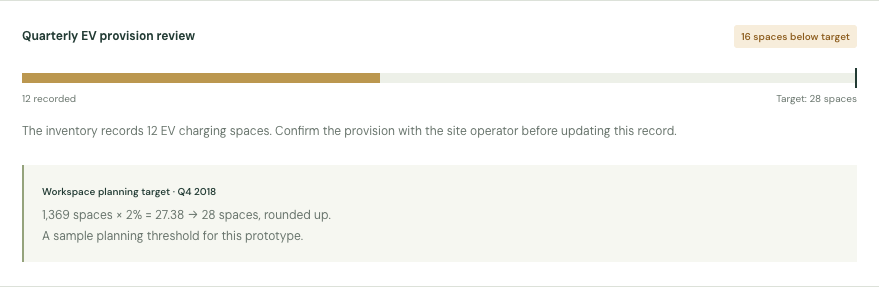
A sample planning target of 2% produces 27.38 spaces at Oosterdok. Rounding up gives a target of 28. With 12 spaces recorded, the gap is 16.
The threshold illustrates the interaction; it is not presented as a national compliance requirement.
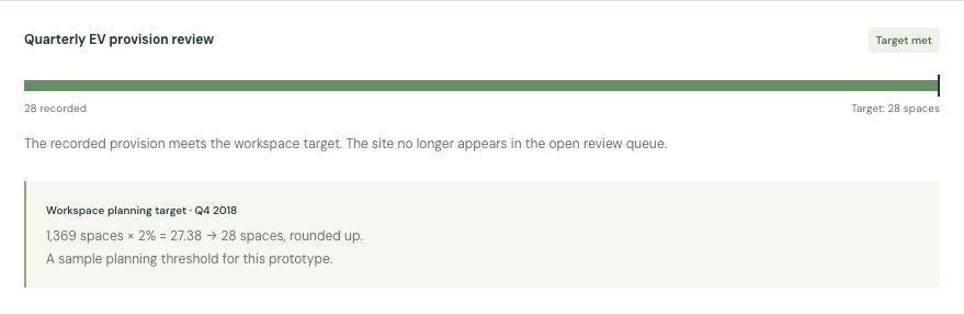
An assignment changes responsibility. Only a verified provision update changes the calculation and, when the target is met, removes the site from the open queue.
05 / Designing the handover
Repeated assignments should not require repeatedly opening a record. But a fast path still needs a visible scope.
Selection introduces the bulk action. The officer chooses an owner and gives a reason, then sees each affected site with its current and proposed owner before confirming.
The operation changes ownership only. Capacity, provision and site status stay untouched. Closed sites are excluded, and sites already assigned to the chosen owner are skipped.
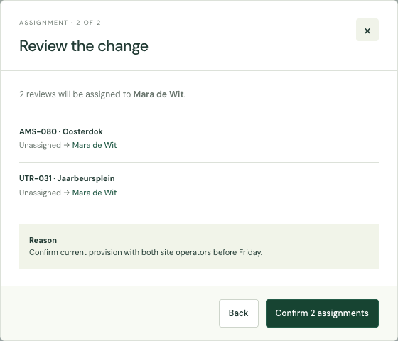
The preview shows what will happen. It also explains what will be skipped, so the final number of changes does not come as a surprise.
The written reason becomes part of the record history. It gives the next officer the context that would otherwise remain in a separate message.
The site history answers a local question: what happened here? Workspace activity answers a broader one: what has the team changed? Both point back to the same site.
Explain that the filters have no matches and offer a clear reset. An empty table alone leaves the cause uncertain.
An unchanged count does not create a new provision event. A note remains available when the officer only needs to record a check.
Keep the inventory record available, while excluding it from active provision reviews and review assignments.
Export follows either the visible filters or the explicit selection. The downloaded records match the scope the officer chose.
06 / From the desk to the field
On a smaller screen, a wide table loses its usefulness. The mobile layout changes the presentation while preserving the site, the task and the history behind it.
Four stable destinations move to the bottom. Labels accompany the icons, and the active destination remains explicit.
Search and notes use full-width controls. Text inputs use a 16px font to avoid the automatic zoom that can interrupt mobile entry.
Capacity, province, status and provision keep their labels when a table row becomes a card. Selection is still available.
A visit to a site preserves the directory filters. Saving a note attaches it to that record, rather than creating an isolated message.
A field-use boundary: this reconstruction demonstrates responsive interaction. Offline synchronisation and installation-photo capture are not demonstrated here.
07 / The design system
The system brings the register, review queue and site detail into the same family. Its job is to preserve hierarchy as the information and screen width change.
The mark borrows the parallel line of a parking bay. A compact wordmark establishes the product once, leaving the working area to the records.
A clear start to the week.
Meaning is also written in the label. Colour supports recognition; it does not carry status alone.
Small intervals connect related values. Larger intervals separate tasks.
One primary action per task. Supporting actions are outlined; unavailable actions recede.
Operating status describes the site. Review status describes the provision gap. They stay separate.
The identity and essential values stay together. Selection belongs to the record, not to an unrelated toolbar.
Desktop rows support comparison. Mobile records repeat the labels locally. The meaning survives the change in layout.
A save updates the record and the review queue. Feedback states the consequence, and history preserves the reason.
Dialogs keep focus inside the task, support Escape, and return focus on dismissal. Motion should support continuity and respect reduced-motion preferences.
The specimens describe the components used in the interface shown here. Product typography stays operational; the case study uses a separate editorial type scale.
08 / Outcome & reflection
Find the site once. Understand the gap in place. Leave the next person a record they can use.
That continuity is the central design contribution: the interface connects tasks that previously required officers to reconcile information across several tools.
The original engagement reported a 40% reduction in average task time and adoption by more than 120 officers. These figures came from operational reporting after rollout, rather than a controlled study of this reconstruction.
Realistic IDs, names and exceptions make prototype feedback concrete. An officer should be able to follow a familiar piece of work through the design.
A provision flag identifies a gap. It cannot verify the inventory or replace a conversation with the operator. The interface should make that boundary clear.
Interrupted entry, poor connectivity and evidence capture deserve their own field testing. Responsive screens are the starting point for that work.